Artistic Tile
A collection of UX Design projects created for a luxury tile & stone company. I was responsible in improving the company's digital space by creating automatic email flows, maintaining the website, and designing landing pages.
The Artistic Digest
-
Overview
A redesign of the Artistic Digest landing page, which showcases the newest digest pieces and an archive.
-
Problem
The newest digest pieces need to be spotlighted to draw in readers browsing through a clean and understandable layout.
-
Goals
Users can easily navigate through the website
Users are enticed to read more than one digest piece
Users are more focused on the newer articles than the old
-
Research
Many blogs and news websites have their newest and/or trending articles at the top taking up most of the screen. They also incorporate captivating imagery and headlines to draw readers in. There is always a subscribe button to ensure that new visitors receive the next newsletter. Even with a huge variety of content, it doesn’t become overwhelming because of a clean and organized layout.
-
Target Users
The main target users are architects, interior designers, and anyone that has a passion for natural stone and tile.
-
Process
Define the problem
Understand the target audience
Evaluate the original design and see what’s not working
Sketch and develop concept for new design
Share prototype with team and get feedback
Finalize design
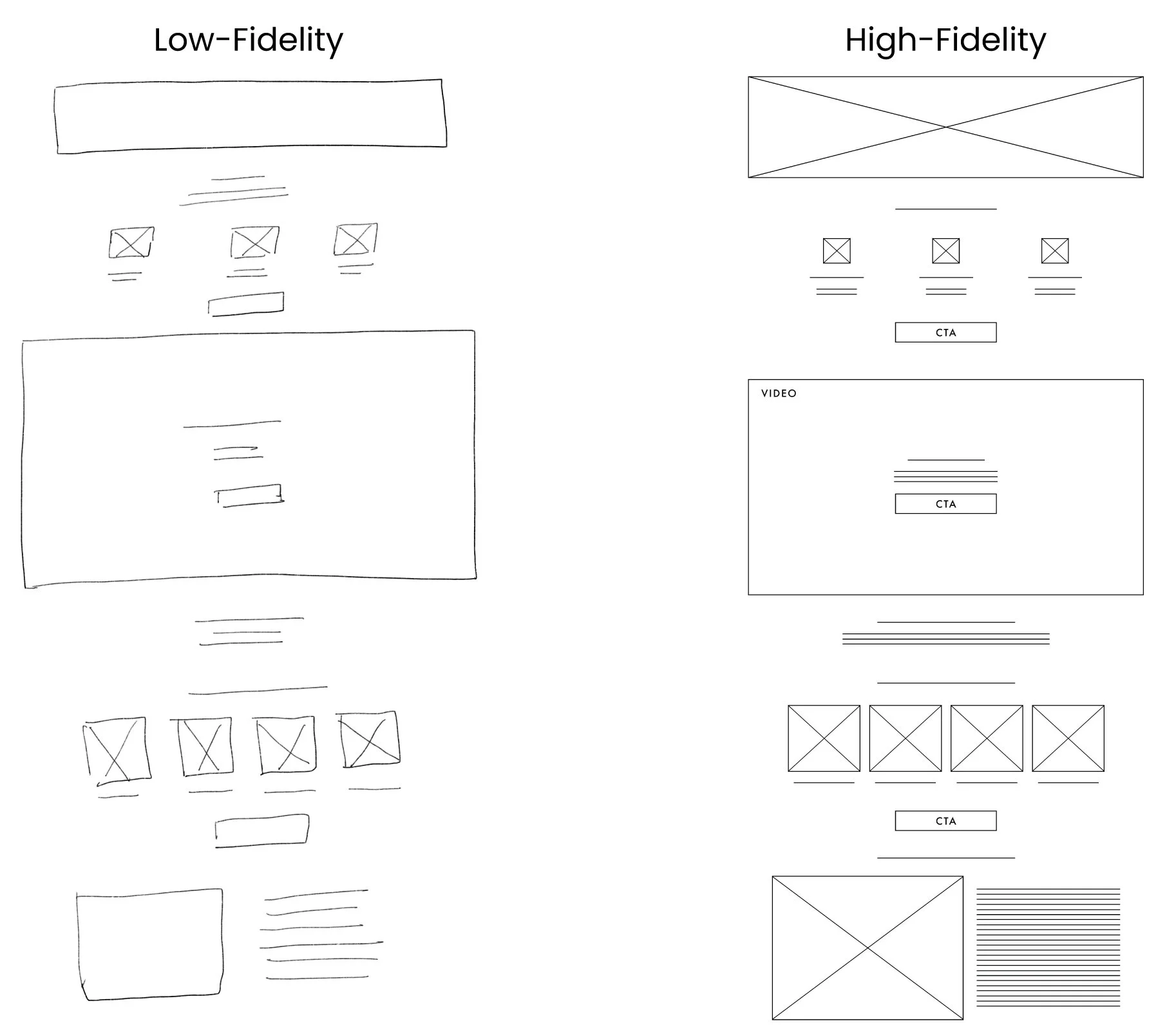
Original Design
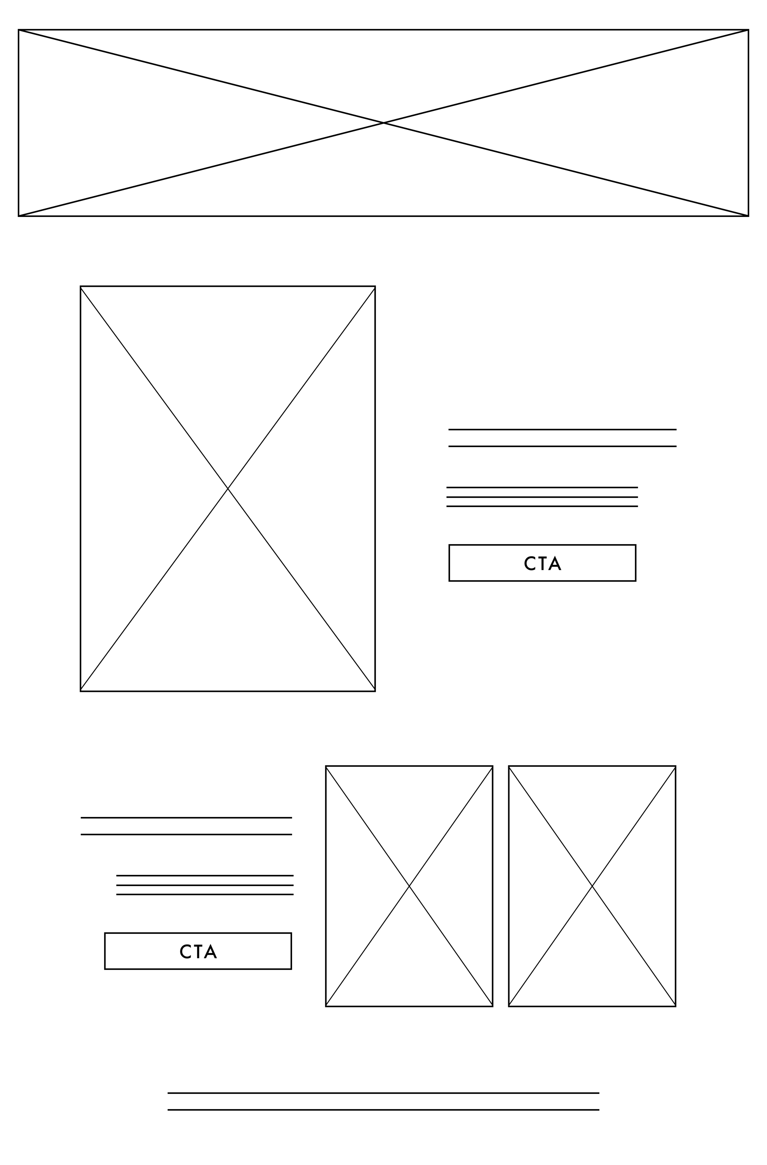
Wireframe
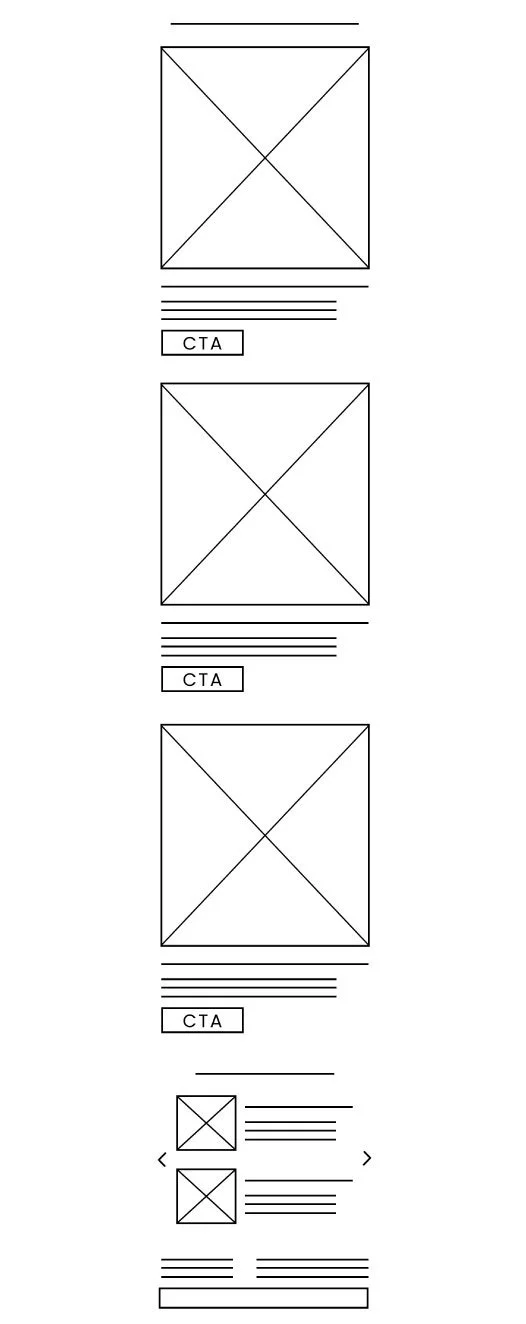
Final Design

The Artistic Digest sets the brand apart from other tile & stone retailers with inspiring imagery and fresh ideas. High quality content won’t be seen if it’s in a cluttered and overwhelming landing page.
Trade Program
-
Overview
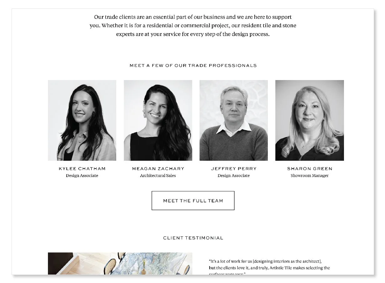
A redesign of a landing page that invites professionals in the tile and stone industry to become a member of their Trade Program.
-
Problem
The original design wasn’t successful in promoting the Trade Program and it was unclear of how to join.
-
Goals
Simplify and condense information about the program and its benefits
Make the application process easy and accessible
-
Research
I researched the value and benefits of joining Artistic Tile’s Trade Program to better understand how they support their clients and their projects.
I surveyed existing Trade Program members to understand what benefits they enjoyed the most.
I researched the target users to get a better sense of what content would be the most valuable.
-
Target Users
The main target users are architects, interior designers, and businesses with tile and stone projects that work on on high-end spaces. These groups of people make up a large sum of the company’s audience.
-
Process
Define the problem and critique the original design
Research
Brainstorm ideas for additional features and content
Sketch and develop concepts
Share prototype with stakeholders for feedback
Finalize prototype, build and publish landing page
Original Design
Wireframes
Final Design
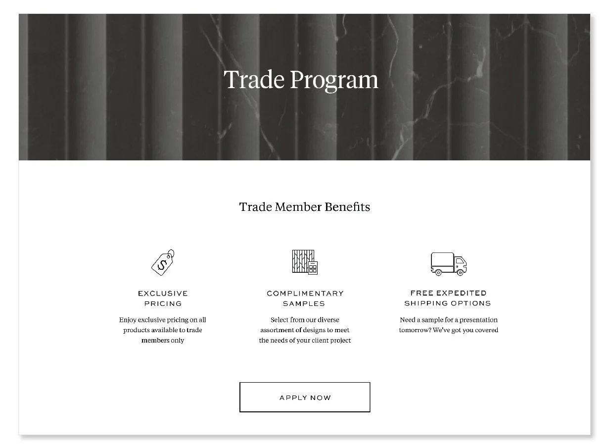
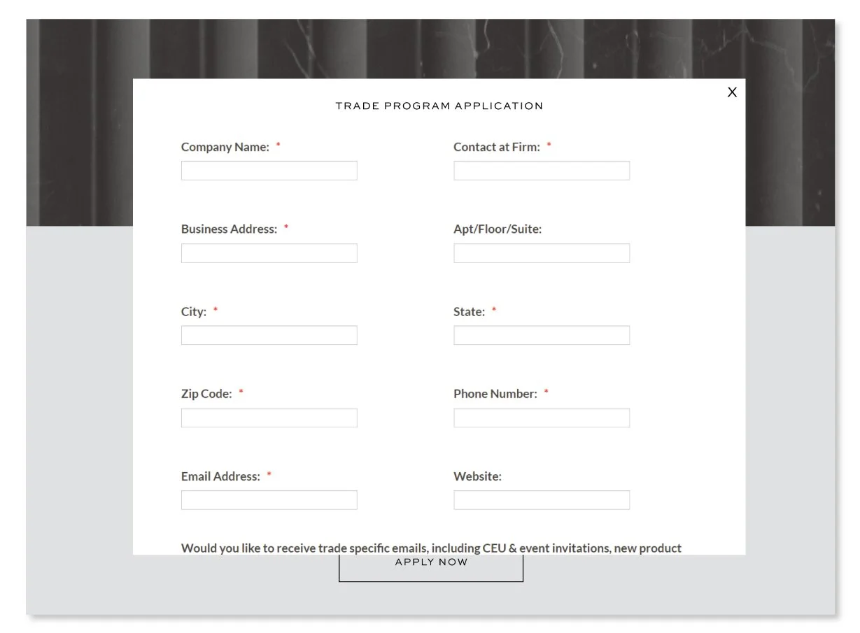
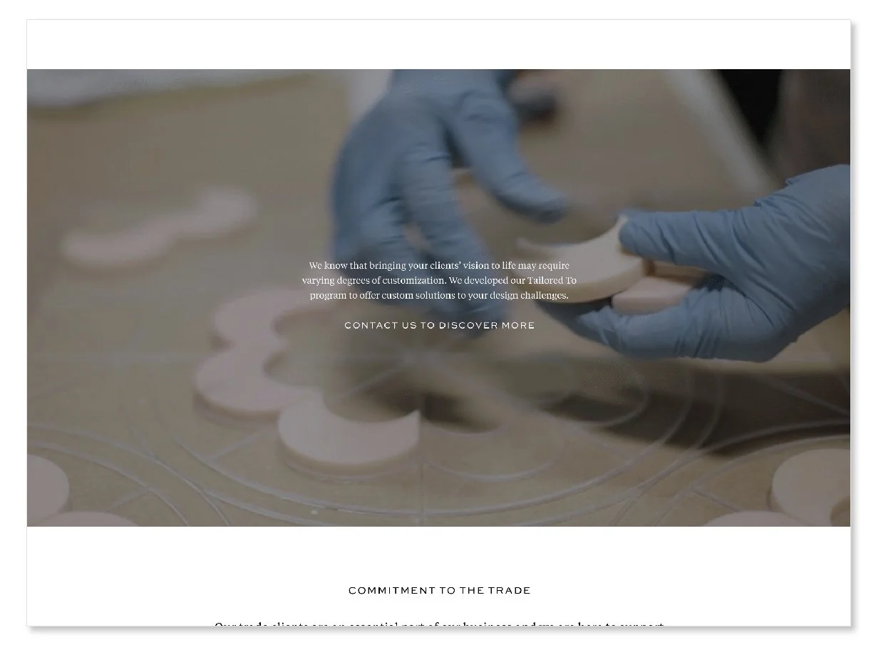
I was initially tasked with embedding the Trade Program application to the landing page, since the application itself lived as a separate link. After scanning the landing page, I realized that there was more work to be done. The ultimate goal was to have viewers be excited and want to join the program. However, small inconveniences, such as the CTA to apply being at the bottom of the page, made it almost impossible to see growth. The information was reorganized and condensed to have users learn about the program and sign up before they click away.
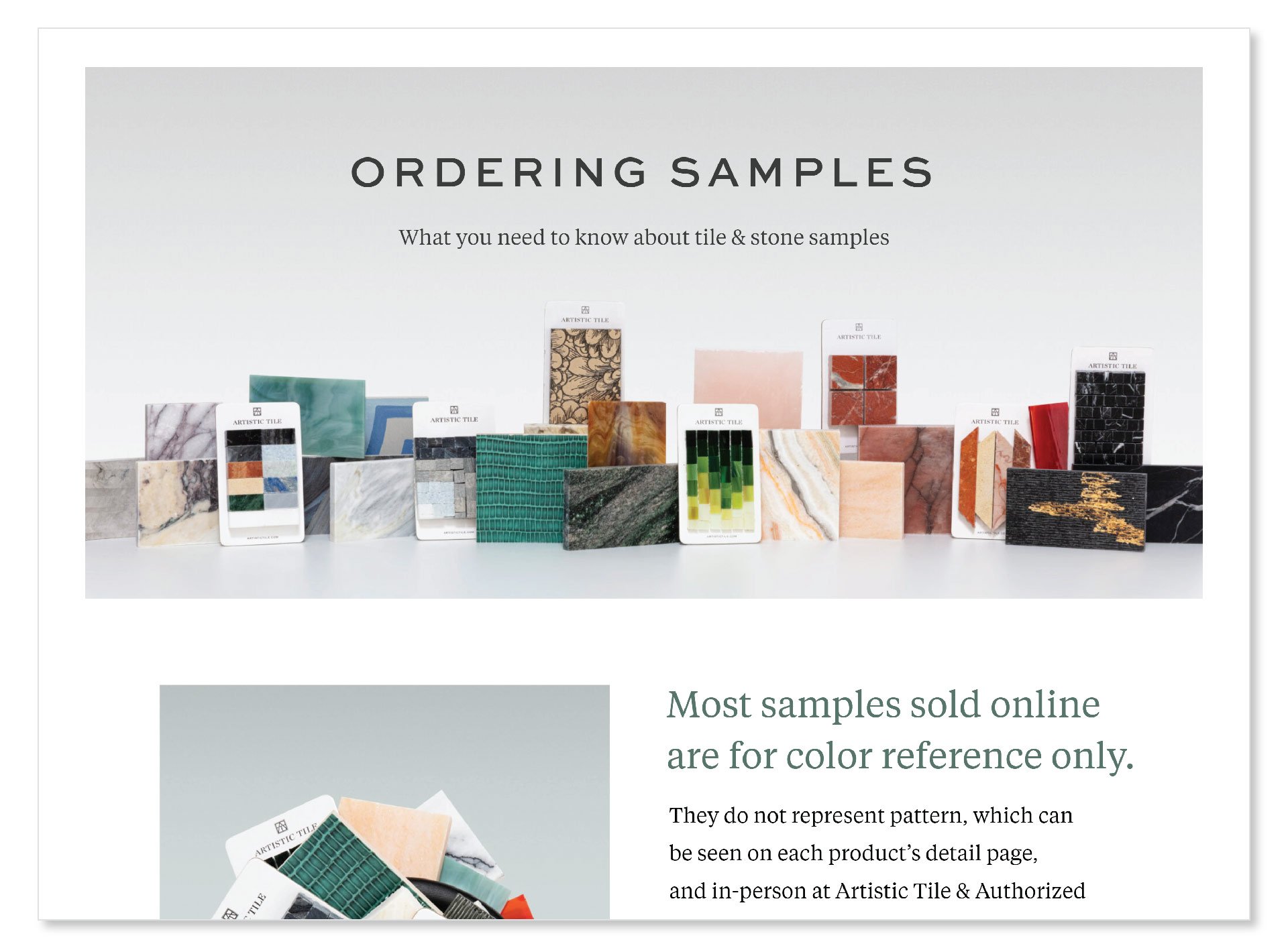
Ordering Samples
-
Overview
A landing page that explains tile and stone samples are for color reference only, and that it may not look like the actual product’s pattern or design.
-
Problem
Samples are expected to look like a small snippet of the original product, but instead they don’t look exactly the same. This causes confusion for many clients who order tile and stone samples for their projects.
-
Goals
Make it clear that samples are for color reference only and will not look like the original product
Encourage users to order samples, shop around the website, and visit a showroom
-
Research
I connected with the Sampling Department to find out which products’ samples caused the most confusion.
-
Target Users
The main target users are architects, interior designers, and anyone that orders tile and stone samples for their projects.
-
Process
Define the problem
Research products’ samples that cause the most confusion
Sketch and develop concept for landing page
Share prototype with team and get feedback
Finalize design and publish