ZDS
I don't just design components — I build systems that scale.
As a core member of the Design Systems team, I architected and own Figma component libraries for desktop and iOS: 120+ components across 5 libraries, used by 25 teams across the organization. But ownership didn't stop at the file. I led the full production lifecycle for 14+ components — driving design direction and staying hands-on through engineering, QA, and delivery to make sure quality never got lost in handoff.
Beyond building, I focused on making the system actually stick. I partnered with 8+ product teams to drive adoption of accessible ZDS components, guiding implementation decisions and translating their needs into roadmap and backlog items — reducing the inconsistencies and custom workarounds that slow teams down.
The result: a design system that's not just well-crafted, but trusted, used, and continuously improving.
ZAIDYN is an AI-powered and cloud-native platform provided by ZS. The ZAIDYN Design System (ZDS) is used for all software products and several custom client applications. Our system includes but not limited to design assets, guidelines, and multiple front-end component libraries supporting various technologies.
Accessibility
Not just a philosophy, but a practice
-
Overview
A revamp of the design system, which includes global styles (color, typography, shadows), a Figma component library, guidelines, and icon library.
-
Problem
The earlier version of the design system lacked maturity and innovation. The Figma library had usability issues, and the components and other assets had poor accessibility. There was also not enough comprehensive documentation to guide internal product teams and achieve a consistent brand across the platform.
-
Goals
Improve the user's workflow with resources for efficient designing.
Maintain consistency and strengthen the ZAIDYN brand across all platform products with clear guidelines and documentation.
To make ZDS a living and breathing system that is constantly innovating and growing.
-
Research
I studied successful design systems that were well-known for achieving a unified and strong brand, easy-to-understand documentation, and accessible component designs.
I was also very self-motivated in learning the best practices in building and maintaining a Figma library. Alongside my day-to-day responsibilities, I dedicated time for Figma tutorials and courses.
-
Target Users
The main users are UX and UI designers on ZAIDYN product teams. UX/UI designers outside of ZAIDYN teams also refer to ZDS.
-
Process
1. Define the problem and pain points
2. Understand the target audience and platform
3. Evaluate the existing design system's maturity and needs
4. Rewrite component documentation and create/update Figma libraries
5. Review changes with engineers and PM and apply feedback
6. Publish Figma libraries and design system documentation
End-to-end component creation
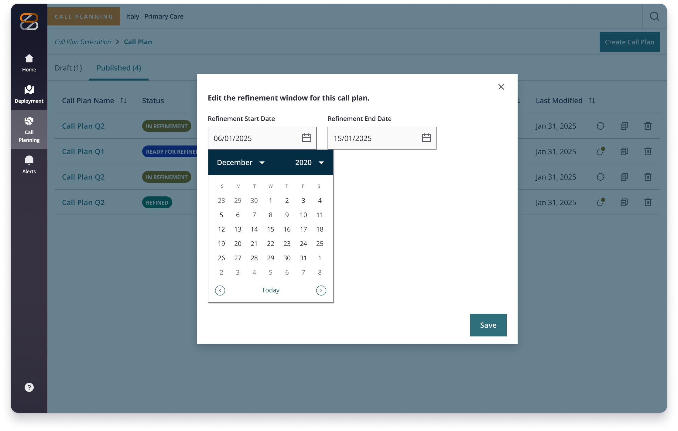
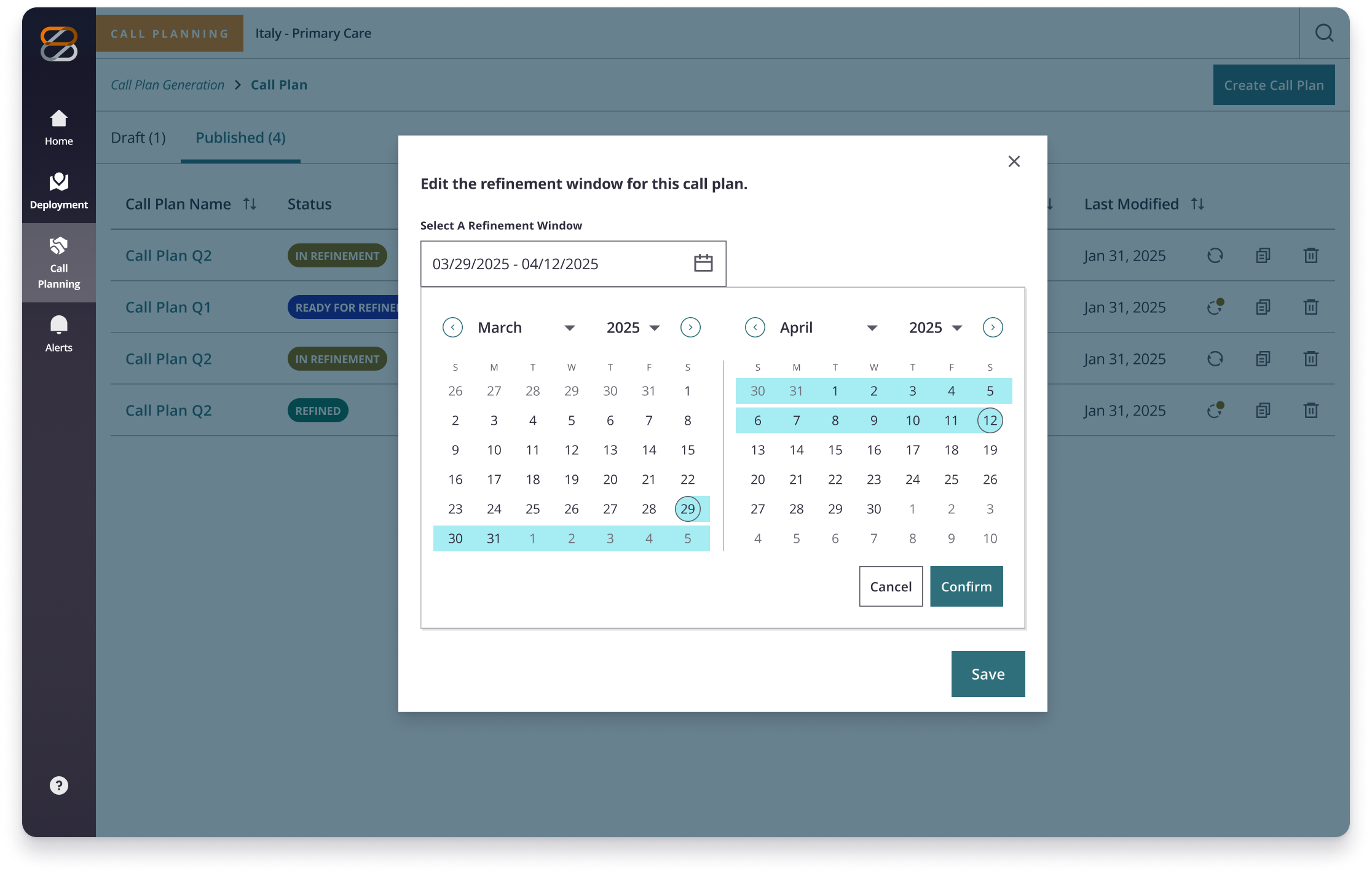
A date range solution already existed, but product teams needed more — a unified two-month calendar view that made ranges spanning across months visible in a single, seamless interaction. The existing two-field approach created friction. Teams needed something more intuitive and ready to scale.
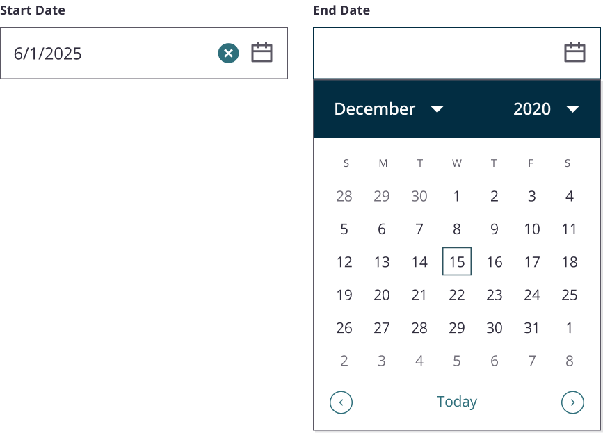
The Date Range Picker was a new standalone addition to the ZDS ecosystem — born from a CAT request and a clear product need. This wasn't a simple enhancement. It required creating a two-month calendar view variant that could support range selection across products while remaining consistent with existing components.
I led design from early exploration through production, collaborating closely with engineering throughout to ensure the final component was flexible, accessible, and ready to scale.
Global Styles
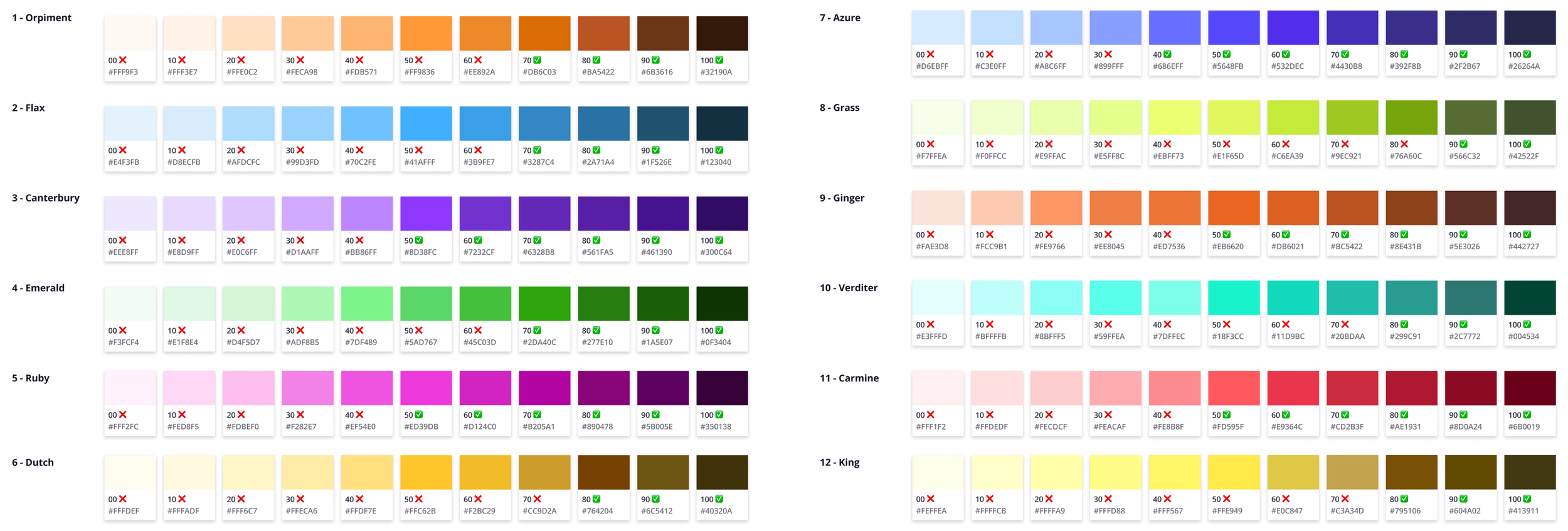
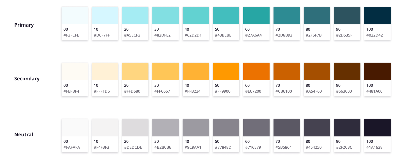
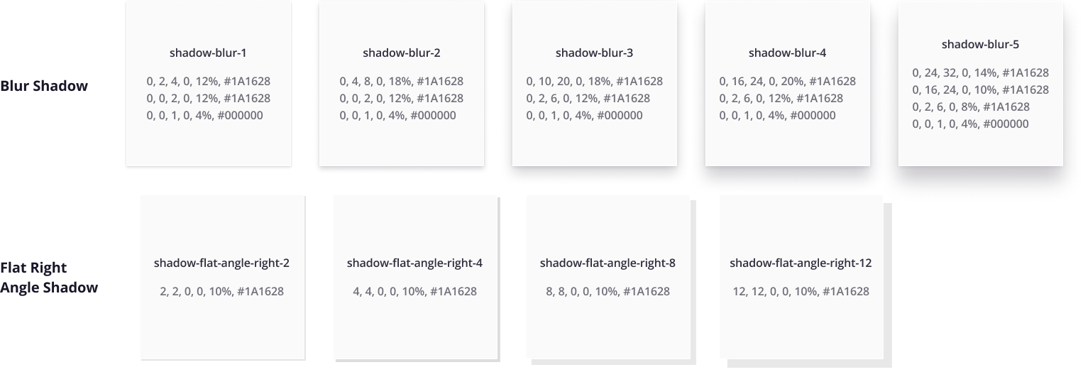
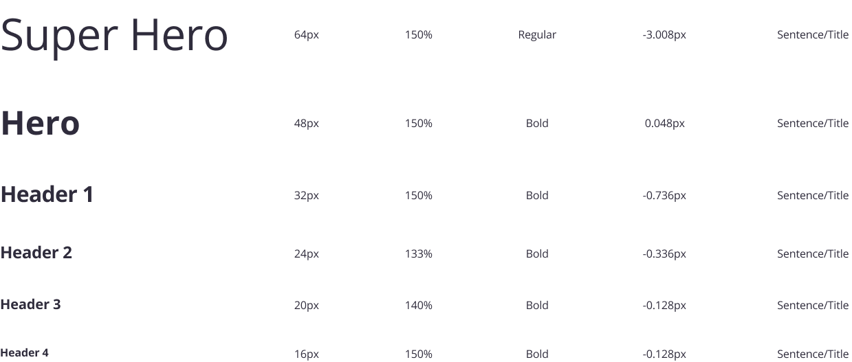
The ZDS global styles library houses color palettes, typography, and elevation/shadow styles. This library is for both iOS and Web ZAIDYN products, and these foundational assets that are used throughout the system. Here are some quick stats:
40 colors each with 11-12 shades per color (includes both light and dark mode)
20 colors each in both light and dark mode
Palette types: ZS brand, semantic, data visualization, opacity colors
67 text styles in Open Sans typeface
7 types of shadows with 4-5 variations for each
Please note that only a few of these styles are shown below.

Global Icon Library
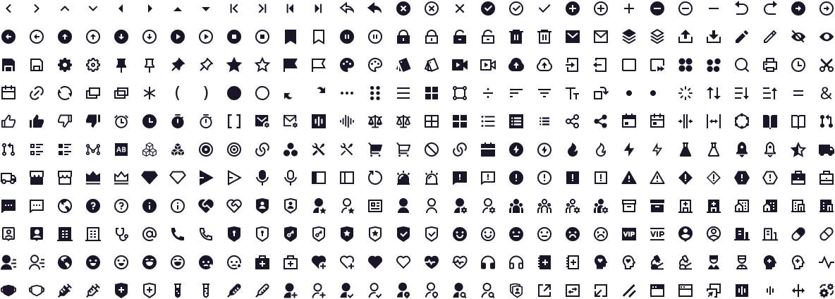
The global icon library is also a resource for both iOS and Web, and most of the icons are from the Remix Design open-source icon library. The icons are organized in to groups according to their intended usage.
Some icons are created for product-specific needs, and they must follow the format…
Reflections
Design Systems wasn't a passion of mine going in. It became one.
I joined at a pivotal moment — the system was being rebuilt from scratch — and that energy was contagious. I found myself deeply invested in getting it right: accessible, scalable, built to last. What I didn't expect was how much I'd love the problem-solving. Designing for a system means holding a lot in your head at once — every product, every version, every client, accessibility at every level, and engineers reminding you that one wrong move is a breaking change. That pressure sharpened me. I wouldn't trade it.